Prioritize Mobile Pages Over Websites

web

web

Business leaders are responsible for allocating their resources in the most efficient way that maximizes profits. So why do they so often drop the ball when it comes to prioritizing web design initiatives?

In general, too much time is spent on websites and not enough on mobile sites, even though most consumers use their phones to search for the goods and services they want way more than their laptops or personal computers. (News Flash: PCs stopped being a thing about five years ago. If you have shopped consumer electronics recently you would have known that already!)

Phones Rule

The reason is simple: Everything you could do on a computer just a few years ago you can now do on your phone — and more. Today’s smartphones are more powerful, faster, and have more inviting features than traditional computers. And you can carry them anywhere.

But the biggest change isn’t with the phones, it’s with streaming capability. Thanks to 4G — and now the nascent 5G — people can stream anything anywhere at speeds that are faster than ever before. And phone plans today are wholly affordable (remember “roaming charges”? As if!)

So if you are a CEO or business owner and are focusing most of your energy on developing a cool-looking, sleek website, that’s fine. Just make sure you also are devoting just as much of your company’s resources — if not more — to the mobile version because that’s the one most people are going to use anyway.

No Mobile? No Way!

If your company doesn’t have a mobile version of its website, what are you even doing? Living in 2005? Drop everything and get your mobile website up and running because your business can’t compete with companies that already are engaging people on their smartphones rather than on their laptops.

Moving forward, smartphones are only going to get faster, smarter, and better. Invest in your future by devoting your energy to mobile sites over traditional websites.


One Business, Two Websites

google maps 2 1

Most businesses today have an attractive, simple-to-navigate website where online customers can browse, book, and buy. But successful businesses actually have two versions of their company website: One for internet users and one for people using portable devices.

Mobile-ready websites represent the next stage for companies seeking to expand their online presence. They tend to be simpler, cleaner, and less wordy than their web-based counterparts. That’s because they are designed to be viewed by people using smartphones, tablets, and other devices with much smaller screens.

Capturing Customers

Traditional websites designed to be viewed on a laptop or home computer have the luxury of space and clarity. They can feature more content, bigger images, and sharper detail.

But thanks to advancements in smartphone technology, significantly faster WiFi speed, and the availability of broadband practically everywhere, an increasing number of consumers are abandoning their computers and doing most of their web surfing on their smartphones. So businesses need to react by creating mobile-friendly websites that are designed to be viewed on these types of devices.

Streamlined for Surfing

Try viewing a website designed for a computer screen on your smartphone and you will instantly see the problem: Text that is too small to read, buttons that are too small to push, and significantly lower loading speed.

Mobile-ready websites have specific features that make them easier to use for people using smartphones and other portable devices, including larger navigation buttons, reformatted content, and images optimized for viewing on iPhones, Androids, and other mobile devices.

Smart companies have smarter, mobile-friendly websites. Successful businesses recognize the trend towards smartphones and take the appropriate steps to ensure they capture the largest possible pool of prospective customers.

If your website has not yet been optimized for mobile viewing, you are absolutely missing out on the growing trend towards mobile surfing.

Optimize Your Website for Mobile Viewing

Results

Website 
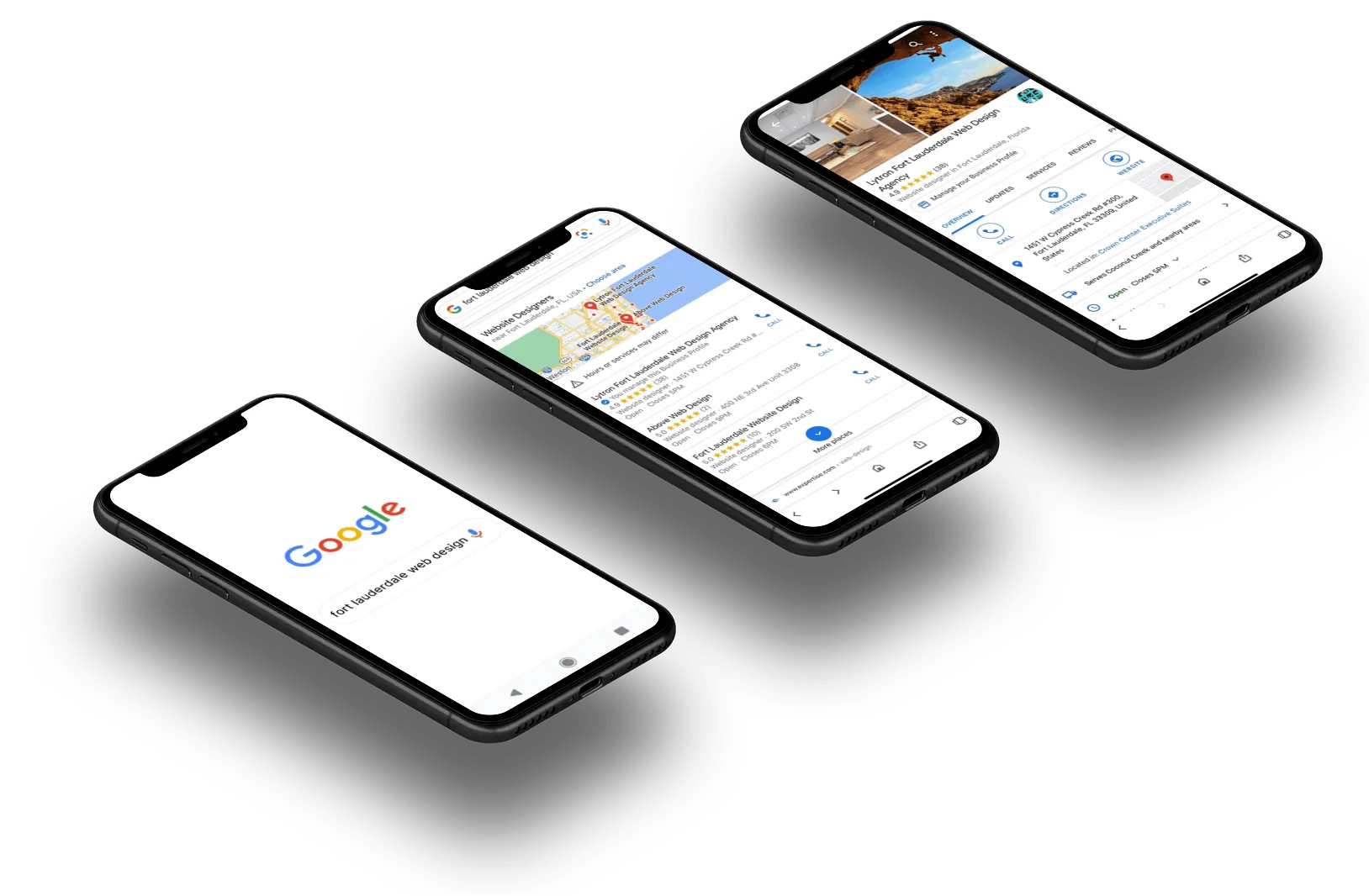
When you go online to look for products or services do you sit down in front of a computer? Or do you simply whip out your smartphone? Odds are you do both — but are more likely to use your phone 66% of the time, according to a report from the Pew Research Center.


Consumers prefer phones over computers because of convenience, location, and speed. Most people don’t have access to their home computer when they are at work, in their cars, or walking around the streets. But when they want to look for that new book they heard about or find a plumber online, they usually aren’t willing to wait until they get home to do it.


Smartphones provide instant access to the Internet from practically anywhere — which is why your website needs to be mobile optimized.


Faster, Better, Stronger


Mobile websites are different than your primary website. If you spent a lot of time and money developing your website for your business so that customers can find your business online, that’s great. But if they click on that website on their phones and it isn’t optimized for mobile phones and tablets, it’s probably going to be slow to load, too crowded to easily read, and not responsive enough for visitors.


That means a lot of visitors — if not most prospective customers — are going to click off and visit the mobile-optimized website of your competitors rather than stick around and try to navigate your old-fashioned, slow, and cumbersome website.


Website – Built for Speed


With 66% of consumers using their smartphones to shop for products and services, you can’t afford to ignore mobile optimization for your website. That’s like shutting the door to 2 out of every 3 customers looking for your business.


Mobile optimization improves the way the majority of customers interact with your business online. So if you don’t yet have it, what’s stopping you?

For Your Next Web Design project, Think Mobile

concentrated programmers browsing internet while w ZBCYLSN Easy Resize.com

Today, more people than ever use their mobile devices as the primary way to search for the information, entertainment, product and services they want.


So if you are focusing your energy optimizing your website design for use on PCs and laptops, you could be wasting your valuable time and effort.


Benefits of Mobile Design


The way websites appear on smartphones, tablets and other mobile devices are different than how they look on computer monitors. For one thing, the screen smaller, so you have less room to create an effective package with your content and images.


Websites also load differently on mobile devices than they do on PCs. So if your website isn’t using a mobile-optimized platform, it could take longer for your site to load on  people’s smartphones — putting you at risk of being dumped for one of your competitors.


For Your Next Web Design project, Think Mobile – Building a Better Mobile-Optimized Website


Creating a mobile optimized website for your business website lets you tap into the growing number of customers who are using their mobile devices as their primary web-access tool.


It also lets you convert more “window shoppers” into paying customers. Plus, it can increase your customer retention rate so you can achieve more repeat sales and develop loyal, long-term customers.


For Your Next Web Design project, Think Mobile – Get the Most from Your Marketing Budget in mobile


By focusing on mobile design for your website, you can optimize your web design budget by achieving a higher return on investment.


Mobile-friendly pages engage customers instantly and encourage them to act on whatever action your website is targeting: Buying a product, becoming a subscriber, clicking through to another page, or whatever your goal is.


Mobile-optimized websites can automatically direct mobile customers who click on your web link or type in your domain name to your mobile site. There they will find better screen definition, faster loading times, and user-friendly navigation.

You May Have a Website, But Is It Mobile Ready?

Your Business

A mobile website is a version of an existing web page that has been optimized to be viewed on mobile devices, which have screens that usually are a lot smaller than the screens on desktops or laptops.


Many websites that were built before the widespread use of smartphones and tablets were written in a language that can’t be easily understood by the browsers used by mobile devices. These browsers usually use faster, more versatile JavaScript to provide content more quickly to their users.


Mobile-optimized websites also account for memory limitations of mobile devices, as well as touch-screen navigation and the bandwidth of wireless networks.


They also can take advantage of the specialized features of mobile devices, such as the ability to take and share high-quality photos and videos, interact in real-time with social media connections, and share texts, links and preferences very quickly.


Benefits of a Mobile-Optimized Website 


According to eMarketer, adult consumers now spend more time viewing media on mobile devices than they use newspapers and magazines combined.


An estimated 73% percent of Americans say their mobile device is now their Number 1 most-used technology device, and 1 out of 4 households have gotten rid of their home phones altogether. Mobile Internet usage is soon expected to overtake desktop Internet access, according to Microsoft Tag.


Cost of Not Having a Mobile Website


That means your customers are making their preference known:


  • Among smartphone users, 74% of all US consumers use location-based services on their smartphones to make buying decisions.


  • ComScore reported that 4 out of every 5 consumers use their smartphones to shop.


  • Of all online searches performed on mobile devices, 80% are spontaneous, according to Hubspot.


  • According to Google, 61% of all mobile web business searches result in a phone call and 59% result in a visit.


That means 8 out of 10 of your customers are using their mobile devices to look for businesses like yours and, once they find them, more than half are going to take action once they find one.


So if your website isn’t already mobile-optimized, we just have one question: What are you waiting for?!

Are You Ready for ‘Mobilegeddon’?

The Benefits of a Responsive Web Design

On Tuesday, April 21, Google once again changed the algorithm its search engine uses to rank web pages. This time, the change adds more value to websites that have been optimized for smartphones.


While the event is being called “Mobilegeddon”, Googles latest update probably won’t have as big an impact as its Penguin and Panda updates earlier this decade. That’s because this most recent improvement doesn’t affect the ranking of sites viewed on laptops, PCs or even tablets. It only affects smartphone searches.


 Advance Notice Given – Are You Ready for ‘Mobilegeddon’?

Google also gave webmasters plenty of notice of their proposed changes this time. Rather than springing the updated algorithm on unsuspecting web page owners — the way it did to disastrous results with Panda and Penguin — the giant Internet company gave nearly two months’ notice, plenty of time for web designers to optimize their web pages.


Mobile-friendly sites have large text, easy-to-click links and are resized to fit on smaller screens. Web sites with these features will now be ranked higher than similar pages that haven’t been optimized for smartphones.


More People Using Smartphones


The move comes in response to a shift in the way most people access the Internet. Today, an estimated 60% of all searches now come from mobile phones. Google’s objective is to provide its users with the best experience so that it is easier for them to click on the links they want to follow when using their smartphones.


Despite the advance notice, any Google update is sure to cause panic among webmasters. And this latest one is no exception.


Most major retailers and companies that depend on Google for much or most of their business probably were aware of the update and were able to make the necessary changes well in advance. But small business owners who don’t pay as much attention to such things could find themselves suddenly far down the search engine results pages for their keywords.